Start your Android app designs correctly with the official Android UI Kit for Figma.
This resource provides the core system components directly from the Android team.
Use it to build interfaces that look and feel native to the Android operating system.
It contains accurate, ready-to-use elements for common Android features, helping you maintain consistency and follow current platform standards in your Figma projects.
Features
- Notification templates
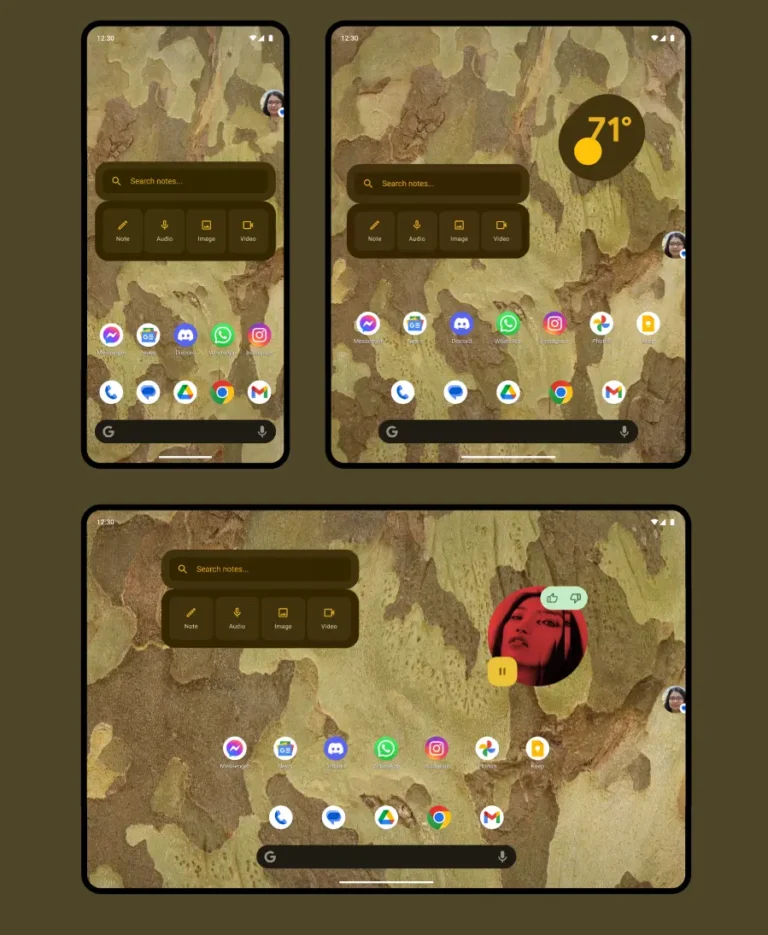
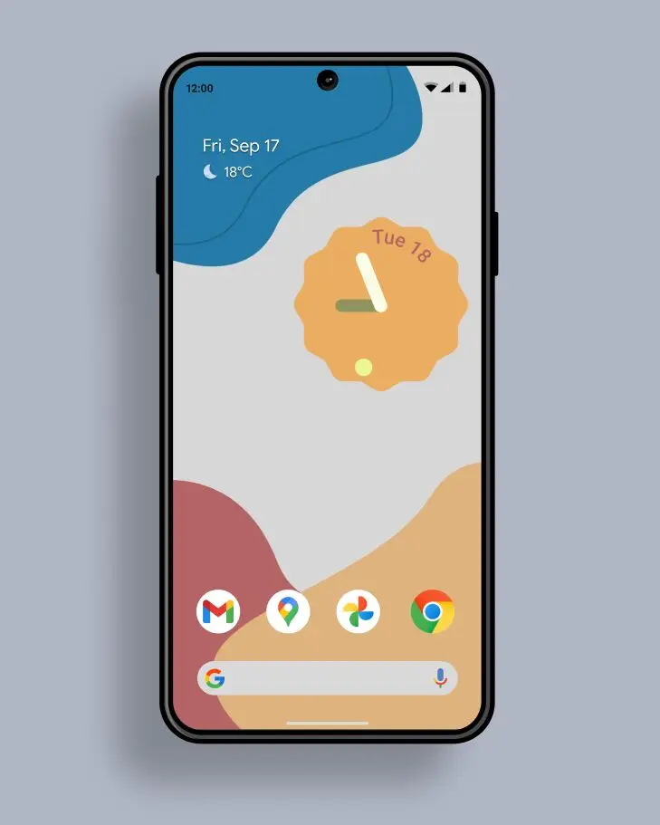
- App widget examples
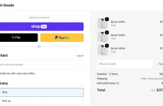
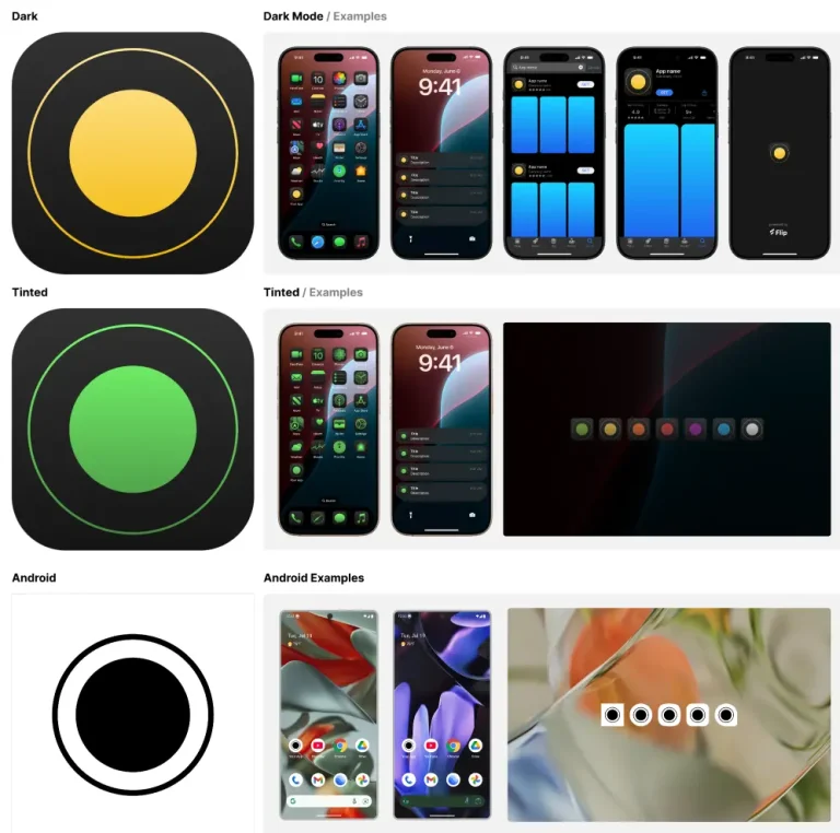
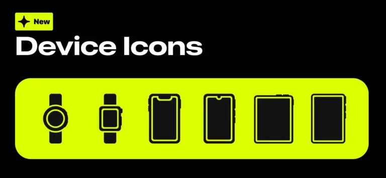
- System bars and device frames
- Camera interface elements
- Bubble and shortcut components
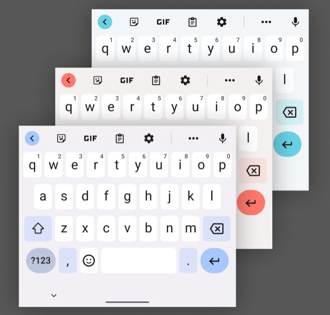
- Android themes and components integration
Use Cases
- Mockup Creation: Quickly build high-fidelity mockups for new Android apps using accurate system UI.
- Design System Alignment: Reference official components to align your custom app design system with Android standards.
- Feature Prototyping: Design flows involving notifications, widgets, or system interactions with precise representations.
- Updating Existing Apps: Revise older app interfaces to match the latest Android look and feel using correct elements.
- Developer Handoff: Provide developers with designs that use recognizable, standard Android components for smoother implementation.
The Android's Official UI Kit in Figma was generously created and offered for free by Android Design - download it now to enhance your next project with a professional-grade asset at no cost.
Unless otherwise specified, you can download and use it free for personal project.
If you encounter a broken or invalid download link on our site, please let us know through our Report Broken Link form.
If you mention it somewhere else, please always link to this page instead of download link.
DISCLAIMER::This free resource is aggregated from the web - we do not claim ownership or hold rights to the design assets. If you find our shared resources infringe upon your copyrights, please let us know via feedback so we can promptly remove them.


